Planer

  • Home
  • Chapters
    • 01: Introduction
    • 02: Visual Ethics
    • 03: Research
    • 04: Design
    • 05: Visualization
    • 06: Maps
    • 07: Diagrams
    • 08: Motion
    • 09: Case Studies
  • Examples
    • Maps
    • Charts
    • Diagrams
    • Data Visualization
    • Interactive Graphics
    • Motion Graphics
  • Resources & Exercises
  • Expert Interviews
  • Tutorials
    • Illustration
    • Motion graphics
    • Data visualization
    • GIS
    • JavaScript
Home 2017 January 25 Data Visualization: Plotting Emotion

Data Visualization: Plotting Emotion

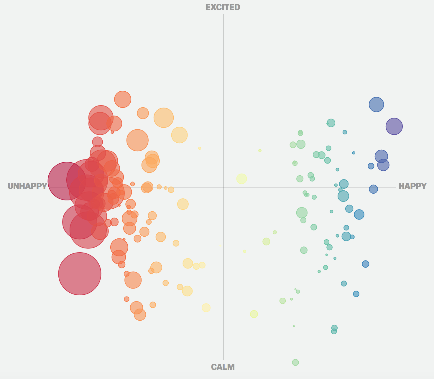
Data visualizations can help us identify and understand relationships with data, even when the data collected is an emotion. On Inauguration Day, Vox created a poll asking readers how they felt about the incoming president. After submitting five emotions, a two-by-two matrix plotted the collective of emotions by their level of happiness and intensity. The plotted words were valued based on their emotional valence, the amount to which they evoke an emotional response. This data visualization is a strong example of coding non-traditional data, to capture the mood of a major event. In total, over 21,000 people submitted just over 72,000 emotions.

Looking at the matrix, readers can immediately identify how their feelings, compared to others. Warm colors represent feelings of discontent and cool colors represent happiness. Circle size, demonstrates the volume of respondents who selected similar emotions. At a glance, it is clear that significantly more respondents felt sad, and of those who felt sad, most emotions were more calm than up in arms. Ultimately, this data visualization is a profound way to document emotion, and capture a snapshot of how American’s felt on a historic day.

Jan 25, 2017 jennpal
Information Graphic: What Time Will the Polls Close?Interactive Map: Sierra Nevadas
Recent Posts
  • Interactive Map: Sierra Nevadas
  • Data Visualization: Plotting Emotion
  • Information Graphic: What Time Will the Polls Close?
  • Data Visualization: The Complete History Of The NFL
  • Aortic Stenosis
Recent Comments
  • Mr WordPress on Hello world!
Archives
  • April 2017
  • January 2017
  • November 2016
  • October 2016
  • September 2016
  • March 2016
  • May 2015
Categories
  • Charts
  • Data visualization
  • Data Visualization
  • Diagrams
  • Examples
  • Exercises & Resources
  • Expert Interviews
  • Featured
  • GIS
  • Illustration
  • Interactive Graphics
  • JavaScript
  • Maps
  • Motion Graphics
  • Motion graphics
  • Tutorials
  • Uncategorized
Meta
  • Log in
  • Entries feed
  • Comments feed
  • WordPress.org
Footer Sidebar 1

Drop a widget on "Footer Sidebar 1" sidebar at Appearance > Widgets page.

Footer Sidebar 2

Drop a widget on "Footer Sidebar 2" sidebar at Appearance > Widgets page.

Footer Sidebar 3

Drop a widget on "Footer Sidebar 3" sidebar at Appearance > Widgets page.

2016
Planer theme by Dankov