Planer

  • Home
  • Chapters
    • 01: Introduction
    • 02: Visual Ethics
    • 03: Research
    • 04: Design
    • 05: Visualization
    • 06: Maps
    • 07: Diagrams
    • 08: Motion
    • 09: Case Studies
  • Examples
    • Maps
    • Charts
    • Diagrams
    • Data Visualization
    • Interactive Graphics
    • Motion Graphics
  • Resources & Exercises
  • Expert Interviews
  • Tutorials
    • Illustration
    • Motion graphics
    • Data visualization
    • GIS
    • JavaScript
Home 2016 September 13 Data Visualization: Hamilton

Data Visualization: Hamilton

screen-shot-2016-09-13-at-11-56-33-am
The critically acclaimed musical “Hamilton” contains incredibly complex rhyming lyrics that draw inspiration from traditional musical theatre as well as modern hip-hop and rap. The Wall Street Journal created an algorithm to visualize the lyrics and analyze how common rhyming and rapping techniques intertwine to create one of the most popular musicals of 2016.

screen-shot-2016-09-13-at-11-56-57-am

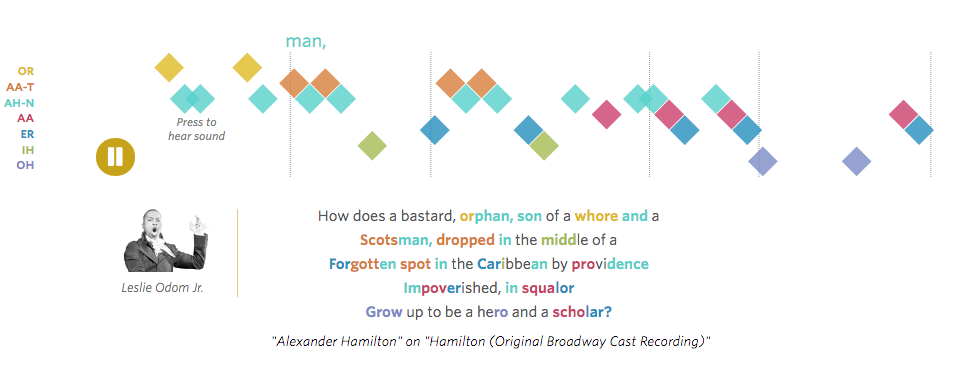
The algorithm used in the data visualization breaks words into their component sounds and groups the similar-sounding syllables into color-coded rhyme families. Perfect end rhymes are red and blue, imperfect rhymes are teal and orange and so on. The beginning of the visualization opens with a recording of a verse from the song “Alexander Hamilton” At first, it can be difficult to understand the rhyming techniques used; however, the visualization breaks down the verse, step-by-step. After learning about different rhyming techniques and understanding the color-coding, it is easy to identify and appreciate the nuances in the lyrics. The data visualization also samples some of today’s popular artists, and demonstrates how the same techniques are present in their lyrics.

This engaging data visualization is more proof that simple visual metaphors can deepen our understanding of complex ideas. In fact, visualizing sound is a profound way to connect the senses, allowing us to appreciate one art form through the lens of another.

Sep 13, 2016 jennpal
Lynda: After Effects Essential TrainingAortic Stenosis
Recent Posts
  • Interactive Map: Sierra Nevadas
  • Data Visualization: Plotting Emotion
  • Information Graphic: What Time Will the Polls Close?
  • Data Visualization: The Complete History Of The NFL
  • Aortic Stenosis
Recent Comments
  • Mr WordPress on Hello world!
Archives
  • April 2017
  • January 2017
  • November 2016
  • October 2016
  • September 2016
  • March 2016
  • May 2015
Categories
  • Charts
  • Data visualization
  • Data Visualization
  • Diagrams
  • Examples
  • Exercises & Resources
  • Expert Interviews
  • Featured
  • GIS
  • Illustration
  • Interactive Graphics
  • JavaScript
  • Maps
  • Motion Graphics
  • Motion graphics
  • Tutorials
  • Uncategorized
Meta
  • Log in
  • Entries feed
  • Comments feed
  • WordPress.org
Footer Sidebar 1

Drop a widget on "Footer Sidebar 1" sidebar at Appearance > Widgets page.

Footer Sidebar 2

Drop a widget on "Footer Sidebar 2" sidebar at Appearance > Widgets page.

Footer Sidebar 3

Drop a widget on "Footer Sidebar 3" sidebar at Appearance > Widgets page.

2016
Planer theme by Dankov