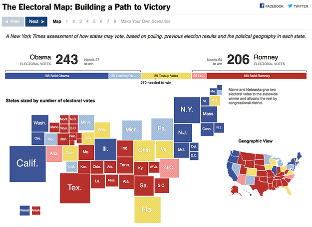
This 2012 New York Times electoral map distorted geography to better represent the size of the electorate in each state. In doing so, it provides a more accurate way to visualize how states may vote, based on polling, previous election results, and the political geography in each state.
Click here to see the New York Times interactive electoral map.


Recent Comments